|
For next years theme I think that a cooking theme would be cool. For the 3 pages you would have to come up with an appetizer, a dinner and a desert all on your own.
http://s1075320.instanturl.net/mcwtwebdesign4girls.net/2014/f231542.128pjC66/index.html
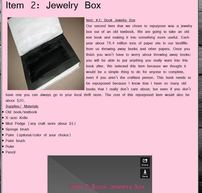
I really like our 3rd page the most! Even though all the pages do look mostly the same, I like it a lot. The second page probably took the longest to do. Actually repurposing the book took a ton of time to do and a very frustrating process. Almost cutting my fingers off and freaking out because of how long it was taking but it was worth it.
In this class I have learned so much. This class is so much more beneficial than a boring math class. I could possibly use the coding, that we learned in one trimester, in the future. Starting from a blank website to what Kara and I have now is really a huge accomplishment for me. Coding is a very time consuming thing to learn how to do. I have learned to problem solve a lot more because when Mrs. Candela is running around helping others and we have a problem, Kara and I try to figure it out before we ask.
Our first page of our website is coming along, it isn't perfect just yet. I think that we will be able to change the things that we dislike and keep the things that we love. My favorite feature would probably be the rollovers and/or the logo. The rollovers just add a touch or creativity to our website as does the logo. My least favorite feature on our website would probably be the background. We have changed our background multiple times and Kara and I just cannot find the perfect background for our theme. In the future i am going to change the table color; right now it is a light blue which went with our old color scheme but not our new color scheme. I would rate our first page a 7 out of 10. I gave our page a 7 because it still needs a lot of work.
The best website I looked at today was Eric Copps, I think that the website was well put together and just looked good in general.
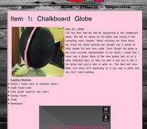
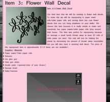
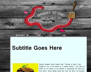
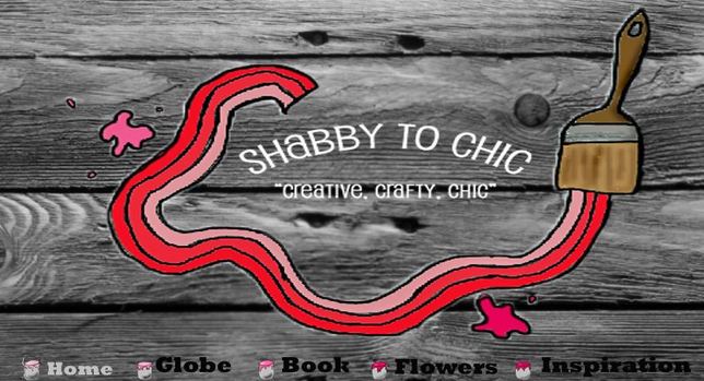
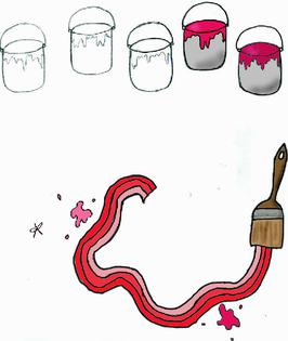
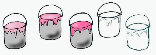
Kara and I's main index picture idea is a rectangle or some kind of shape. Our banner idea is having a rectangle with our logo inside the rectangle. Inside our logo we will have our title. We aren't sure on what our title is going to be yet. Our thought process was having the brush strokes from our logo being the actual banner. We will also have the brush strokes corresponding with our navigation icons which are the paint buckets. 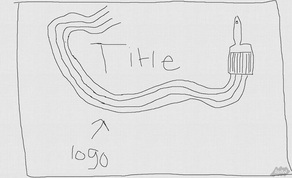 Our three repurposed items are an old globe, paper towel rolls and a book. To transform these items we will be painting, cutting and gluing the items. The globe will become a chalkboard globe, the paper towel rolls will become flowers that you can hang on your wall for decoration and the old book will become a jewelry box. Our main color for our logo is pink. Pink represents healthy, happy, feminine, compassion, sweet, sense of well-being, love, and friendship. The hex code for a shade of pink is #FF69A4. Our tagline is "Creative, Crafty, Chic." Kara and I found that rendering our logo and navigation icons, were pretty easy. At times it got frustrating but we figured the things out. The tool that we found the most helpful was the brush tool. This tool helped us a lot with outlining everything.
|
AuthorMy name is Veronica Steinmetz and I am learning to create my own website. Archives
November 2014
Categories |
 RSS Feed
